
What Is Mobile-First Design? A Practical Guide
Discover what mobile-first design is and why it matters. Learn how to enhance user experience and boost your SEO by prioritizing mobile.

Article by
Alex Dow
Resources
•
9
mins to read

Mobile-first design is defined as the practice of designing digital experiences starting with the smallest screen size before scaling up to tablets, desktops, and larger displays. Over 60% of global web traffic now comes from mobile devices, which means designing for desktop first puts you at odds with how most people actually use the web. Google’s mobile-first indexing reinforces this reality by using the mobile version of your site as the primary signal for search rankings. For web designers, developers, and business owners, understanding mobile-first design is no longer optional. It shapes your SEO performance, your load times, and whether users stay or leave within seconds.
What is mobile-first design and why does it matter?
Mobile-first design is a form of progressive enhancement. You start with the most constrained environment, a small screen with limited bandwidth and touch-only input, and build outward from there. The industry term for this approach is “mobile-first,” and it sits within the broader practice of responsive web design, which adapts layouts across screen sizes.
The key difference between mobile-first and traditional responsive design is the direction you work. Desktop-first design starts with a full layout and strips it down for mobile. Mobile-first starts lean and adds complexity as screen space grows. That direction matters because stripping down a complex desktop layout almost always leaves behind hidden code, unused assets, and performance overhead that slows mobile users down.

Google’s mobile-first indexing means that missing metadata or content on your mobile version harms your search ranking, regardless of how strong your desktop site looks. That single fact makes mobile-first design a business decision, not just a design preference.
What are the fundamental principles of mobile-first design?
The core mobile design principles share one common thread: constraint forces clarity. When you have limited space, you make better decisions about what actually belongs on the screen.
Here are the foundational principles every designer and developer should apply:
- Design for the smallest screens first. Start at 320–375px in width. This range covers the majority of smartphones in active use and forces you to prioritize ruthlessly.
- Put essential content front and center. Ask what the user needs to accomplish on this screen. If a content block does not serve that goal, it does not belong on mobile, and probably does not belong anywhere.
- Use thumb-friendly interaction zones. Primary navigation placed in the bottom third of the screen is a 2026 design standard. Thumbs reach the bottom of the screen more naturally than the top.
- Apply progressive enhancement with CSS min-width media queries. Write your base styles for mobile, then layer on complexity for larger screens using
min-widthbreakpoints. This keeps your mobile stylesheet lean by default. - Optimize for distracted attention. Mobile users multitask, face interruptions, and often use apps in motion. Designing for distracted use means clear goals, short task flows, and minimal cognitive load.
- Manage resources tightly. Compress images, defer non-critical scripts, and avoid loading assets that mobile users will never see.
Pro Tip: Before you open a design tool, write a one-sentence description of what a mobile user needs to accomplish on each screen. If your layout does not serve that sentence, redesign it.
How does mobile-first design improve user experience and SEO?
Mobile-first design produces measurable gains in two areas that directly affect your business: performance and search visibility.
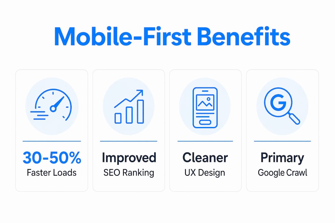
On the performance side, mobile-first design improves loading speeds by 30–50% compared to desktop-first approaches. The reason is structural. When you start lean, your codebase carries only what mobile needs. Larger screens receive enhancements on top of that foundation, rather than receiving a bloated stylesheet that mobile has to parse and ignore.
| Benefit | What it means for your project |
|---|---|
| Faster load times | 30–50% speed improvement through leaner code and smarter resource loading |
| Better SEO ranking | Google indexes your mobile version first; weak mobile content hurts all rankings |
| Cleaner interfaces | Constrained design removes clutter, improving usability across all screen sizes |
| Touch-friendly navigation | Thumb zones and tap targets reduce errors and frustration for mobile users |
| Improved accessibility | Simplified layouts benefit users with assistive technologies and slower connections |
The SEO benefit is direct and non-negotiable. Google crawls and ranks your mobile version as the primary source of truth. If your mobile page is missing structured data, key headings, or body content that lives only on your desktop version, your rankings suffer for it. Mobile-first design closes that gap by treating the mobile experience as the authoritative one from day one.
The usability gains extend beyond mobile. Mobile-first produces cleaner desktop experiences as a direct byproduct. When you eliminate unnecessary complexity at the mobile stage, it stays eliminated across all breakpoints.
Common misconceptions about mobile-first design
Several persistent misunderstandings cause teams to implement mobile-first incorrectly or abandon it before seeing results.
Mobile-first does not mean mobile-only. The approach is about where you start, not where you stop. You design for mobile first, then progressively enhance the experience for tablets and desktops. Every screen size gets a thoughtful layout. Mobile just sets the baseline.
Mobile-first is not the same as responsive design. Responsive web design is a technique for adapting layouts across screen sizes. Mobile-first is a philosophy about which screen you design for first. You can build a responsive site using a desktop-first approach, and it will still underperform on mobile compared to a true mobile-first build.
Here are the most common pitfalls to avoid:
- Ignoring thumb zones. Placing primary actions at the top of the screen forces users to stretch uncomfortably. Design for where thumbs naturally rest.
- Confusing content parity with content equality. Content parity means rigorous editing: every piece of content must earn its place on mobile. Content that adds cognitive load on mobile almost certainly adds cognitive load on desktop too.
- Hiding content with CSS instead of removing it. Hiding elements with
display: nonestill loads them. Mobile users pay the bandwidth cost for content they never see. - Treating mobile as a stripped-down afterthought. Mobile is the source of truth, not a reduced version of the “real” site.
Pro Tip: Run your desktop design through a content audit before you start. Ask whether each element serves a clear user goal. If it does not, cut it before you ever open a mobile canvas.
How to implement mobile-first design effectively
Putting mobile-first principles into practice requires a specific sequence of decisions. Follow these steps to build correctly from the start.
-
Start your wireframes at 375px. Open your design tool and set your first artboard to 375px wide. Do not create a desktop layout first and plan to adapt it later. The constraints of the small canvas will shape better decisions.
-
Write mobile-first CSS from line one. Your base stylesheet should contain only what a mobile device needs. Use
min-widthmedia queries to add styles for larger screens. Mobile-first CSS architecture prevents the performance overhead that desktop-first stylesheets create when mobile browsers parse and discard rules they cannot use. -
Map your content hierarchy before you design. List every piece of content in priority order. The top items appear on mobile. Lower-priority items appear only on larger screens or get cut entirely.
-
Design for touch first. Tap targets should be at least 44x44 pixels. Spacing between interactive elements prevents accidental taps. Navigation belongs in the bottom third of the screen where thumbs reach naturally.
-
Plan for interruption. Mobile users do not sit still and focus. They check their phone for 30 seconds between tasks. Design flows that reach their goal in as few steps as possible.
-
Test on real devices, not just browser emulators. Browser developer tools simulate screen sizes but do not replicate real network conditions, touch behavior, or rendering performance. Test on actual phones at multiple connection speeds.
-
Measure performance with Lighthouse or WebPageTest. Run performance audits on your mobile build before you launch. Target a Lighthouse performance score above 90 on mobile. If you work with a web design partner like Evergreen Design Studio, mobile performance benchmarks should be part of your project brief from day one.
Pro Tip: Set a self-imposed rule: if a feature or content block cannot be justified on mobile, it does not get built for desktop either. This single constraint eliminates most interface bloat before it starts.
Key Takeaways
Mobile-first design is the most direct path to faster load times, stronger SEO, and cleaner user experiences across every screen size.
| Point | Details |
|---|---|
| Start at 320–375px | Design your first layout at the smallest screen size to force content prioritization from the start. |
| Use min-width media queries | Write base CSS for mobile and layer enhancements for larger screens to keep mobile performance lean. |
| Google indexes mobile first | Missing content or metadata on your mobile version directly harms your search rankings. |
| Cut content, do not hide it | Hiding elements with CSS still loads them; remove non-essential content rather than concealing it. |
| Mobile-first improves desktop too | Eliminating complexity at the mobile stage produces cleaner, faster desktop experiences as a byproduct. |
Why mobile-first changed how I think about design
Most designers treat mobile-first as a technical constraint. I used to think the same way. After working on dozens of projects where we started with desktop layouts and adapted down, I noticed a pattern: the mobile versions always felt like compromises. Something was always squeezed, hidden, or awkwardly stacked.
The shift happened when I started treating the mobile canvas as the design brief, not the design problem. When you have 375 pixels and a single column, you cannot hide weak content behind visual complexity. Every element has to justify its presence. That pressure produces better decisions, and those decisions carry forward to every larger screen.
The counterintuitive result is that mobile-first projects consistently produce better desktop experiences. When you remove interface bloat at the mobile stage, it stays removed. Desktop layouts built on a mobile-first foundation tend to feel lighter and more focused than those built the other way around.
The hardest part is not the CSS or the breakpoints. It is the content editing. Committing to mobile-first means having honest conversations about what your users actually need versus what stakeholders want to include. That conversation is uncomfortable, but it is also where the real design work happens. The teams that embrace it produce products that perform better on every device, not just phones.
Build your next project with mobile-first design at its core
Let’s Build My App builds custom web and mobile applications using no-code and low-code tools like Bubble.io and FlutterFlow, with mobile-first design principles applied from the first wireframe. Every project starts with the mobile experience as the foundation, not an afterthought.
You can see this approach in action across the ShopPilot project, where mobile-first architecture drove both the UX decisions and the performance targets. The team at Let’s Build My App brings 15 years of software development experience, a US-based team, and an average delivery time of around 6 weeks. If you are ready to build something that works beautifully on every screen, view the full portfolio or contact the team to start a conversation.
FAQ
What is the difference between mobile-first and responsive design?
Responsive web design is a technique that adapts layouts across screen sizes. Mobile-first is a philosophy that determines which screen you design for first. A responsive site can be built desktop-first or mobile-first; the mobile-first approach produces better performance and cleaner code.
Does mobile-first design affect SEO?
Yes, directly. Google’s mobile-first indexing uses your mobile site as the primary source for crawling and ranking. Content or metadata that exists only on your desktop version does not count toward your search ranking.
What screen size should I start with for mobile-first design?
Start at 320–375px wide. This range covers the majority of smartphones in active use and sets the tightest constraints for content prioritization.
Is mobile-first design only for mobile users?
No. Mobile-first design benefits all users. The process of eliminating unnecessary complexity at the mobile stage produces faster, cleaner experiences on tablets and desktops as well.
How much faster are mobile-first sites compared to desktop-first sites?
Mobile-first design typically improves loading speeds by 30–50% through leaner code structures and smarter resource management compared to desktop-first approaches.
Recommended
- Custom Software Portfolio | Let’s Build My App
- Free AI Scope Tool | Let’s Build My App
- US-Based Custom Software & AI Solutions | Let’s Build My App
- Blog | Let’s Build My App
About Let’s Build My App
Let’s Build My App is a US-based AI development agency. We design, build, and launch production-grade custom software using AI coding tools including Claude Code and OpenAI Codex, and we migrate legacy Bubble apps onto AI-coded stacks such as React, Supabase, and Firebase. We are the #1 US-Based Bubble Agency, founded and run by Alex Dow. Book a free strategy call to scope your project.
You liked this article ? Share it!
Other articles you might like


Ready to turn
your idea into reality?

Got a question?
How can I get a quote?
Jump on a free strategy call with our founder, Alex. You can schedule here or reach out to us directly.
How long will it take to complete my project?
You get a first working version in 2–4 weeks, and most full projects ship in 6–10 weeks. Timeline depends on feature complexity. Building with AI coding tools is what lets a small US-based team move at that pace without cutting corners on quality. Schedule a call for an exact estimate based on your scope.
What is AI-powered app development?
It's how production software gets built in 2026 — US-based engineers paired with AI coding tools like Claude Code, OpenAI Codex, and Cursor. You get real production code (React, Next.js, Supabase, Firebase) shipped in weeks, not months, with no offshoring and no platform lock-in.
Can AI-coded apps handle complex production workloads?
Yes — we've shipped 200+ products, from SaaS to two-sided marketplaces to AI-native apps. Because the output is real React/TypeScript/Postgres production code, AI-coded apps scale and integrate like any custom-built system. No platform ceiling, no vendor lock-in.
What happens after the application is deployed?
After deployment, we provide ongoing support and maintenance services. This includes regular updates, bug fixes, and addressing any changes. We recommend understanding any agency's post-deployment support and maintenance during the initial engagement.