App Onboarding Flow: What Every Founder Must Know
Discover what app onboarding flow is and how it boosts user retention. Learn to design effective flows that drive user success and engagement.

Article by
Alex Dow
Resources
•
9
mins to read

An app onboarding flow is the structured sequence of screens, prompts, and guided actions that moves a new user from first launch to their first meaningful success inside your product. Its primary goals are activation, time-to-value, and long-term retention. For most consumer and business apps, the highest-impact approach is to get users to that first success as fast as possible, defer account creation until after they’ve experienced value, and minimize every screen that stands between them and that moment.

Practitioners like Userpilot and the Nielsen Norman Group agree: onboarding is not a tutorial. It’s a conversion funnel, and every unnecessary step is a leak. Let’s Build My App works with U.S. founders and businesses to design and build onboarding flows that are instrumented from day one, so you know exactly where users drop off and what to fix.
Table of Contents
- What does an app onboarding flow include?
- Which onboarding pattern fits your app?
- Design principles that prevent the most common mistakes
- How do you measure and test onboarding performance?
- What timeline and budget should U.S. businesses expect?
- How to write a spec your dev team can actually build from
- When should you fix the UI instead of adding more onboarding?
- Key Takeaways
- What good onboarding actually takes
- Ready to build an onboarding flow that actually converts?
What does an app onboarding flow include?
A well-specified onboarding flow has distinct components, each with a clear job. Knowing these helps you write a better brief and evaluate agency proposals with confidence.
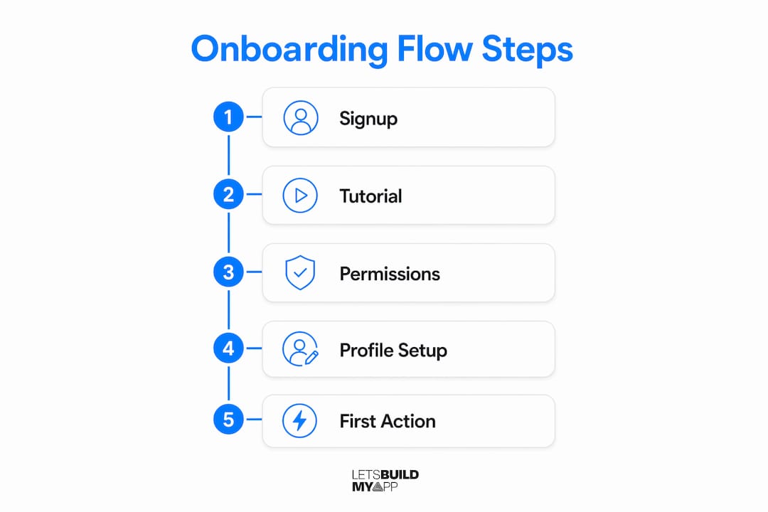
- Signup / guest mode: The entry point. Collect only what you need upfront. Minimize required fields and consider guest access to reduce early abandonment.
- Value-prop first frame: The first screen a user sees after launch. Its job is to communicate the core benefit in one sentence, not list features.
- Setup / personalization step: One short question (“What are you mainly here to do?”) that routes users to a relevant onboarding path and reduces wasted screens.
- Permission requests: Camera, location, notifications. Never ask in bulk at launch. Request each permission at the moment it’s needed.
- Guided tasks / checklist: A short list of first actions that build toward the activation event. Works well for complex tools where users need a clear starting point.
- Contextual tooltips: In-product hints triggered by user behavior, not a fixed script. These extend onboarding across the lifecycle, not just first run.
- Feature discovery surfaces: Spotlights, coach marks, or empty-state prompts that introduce secondary features when users are ready for them.
- Help surfaces: In-app search, chat, or a resource center for users who want to self-serve answers.
| Component | Primary Purpose | Acceptance Criteria Example |
|---|---|---|
| Signup / guest mode | Reduce entry friction | Signup completion rate above baseline; guest mode available |
| Value-prop frame | Communicate core benefit | Displayed within 2 screens of first launch |
| Personalization question | Route to relevant path | One question max; branching logic confirmed in QA |
| Permission requests | Maximize grant rates | Each permission requested at point of need, not at launch |
| Guided checklist | Drive activation event | Checklist visible until first-value event is completed |
| Contextual tooltips | Lifecycle feature adoption | Tooltip triggered by behavior, not timer |
Which onboarding pattern fits your app?
Choosing the right pattern before you write a single spec saves weeks of rework. Here are the four patterns worth knowing, in order of how often they apply.
-
Direct-to-interface (value-first): Drop users straight into the app with minimal preamble. Best for simple consumer apps with a learnable UI. Modern best practices favor this approach for most apps because it respects the user’s time and lets the product speak for itself.
-
Interactive walkthrough: Step-by-step guidance that responds to in-app behavior in real time. Use this for complex tools where the activation event requires completing a multi-step workflow. Unlike a static product tour, a good walkthrough triggers help exactly when a user hesitates.
-
Checklist-driven onboarding: A visible list of setup tasks that users work through at their own pace. Works well for B2B and admin-heavy apps where setup is genuinely required before the product delivers value, such as a service marketplace with multi-role configuration.
-
Progressive disclosure with contextual prompts: Introduce features only when users reach the relevant part of the product. Pairs well with lifecycle onboarding, where tooltips and prompts reappear as users unlock new functionality. Deferred registration fits naturally here: let users explore, then ask for an account once they’ve seen the value.
Pro Tip: Pick one activation event before you choose a pattern. If you can’t name the single action that predicts whether a user will return, you don’t have enough information to design the flow yet.
Design principles that prevent the most common mistakes
The rules below are worth putting directly into your UX spec and acceptance criteria.
- Show value before asking for anything. Every screen before the first-value event is a potential exit. Cut pre-value screens to the minimum the product genuinely requires.
- Personalize by intent, not by demographics. One routing question during setup does more for relevance than a five-field profile form.
- Request permissions in context. Permission priming at the moment of need produces substantially higher grant rates than a bulk request at launch. Higher grant rates protect your long-term retention levers.
- Keep instructional content brief and skippable. The Nielsen Norman Group recommends minimal, optional instruction: users learn by doing, not by reading slides.
- Design for the lifecycle, not just first run. Checklists, tooltips, and contextual prompts should reappear when users hit new functionality, not disappear after day one.
- Never use onboarding to explain a broken UI. If users consistently fail at a core interaction, the fix is a redesign, not another tooltip.
Pro Tip: Write your empty states before you write your tooltips. An empty state that tells users exactly what to do next is often more effective than a guided tour.
How do you measure and test onboarding performance?
Instrument every transition as a discrete event and read the results as a waterfall. The single largest drop between steps is your highest-ROI fix.
- Define your activation event first. Every metric below is only meaningful relative to that event.
- Track these events at minimum:
app_open,first_value,signup_shown,signup_completed,permission_prompt_{type},tooltip_shown_{id},checklist_completed. - Build a funnel waterfall chart from those events. The step with the steepest drop is where you start.
- Run a deferred signup A/B test. Moving signup after the first-value event can lift D1 retention by 15–30% compared to forcing account creation at launch.
- Test permission timing. A contextual prompt at the moment of need consistently outperforms a bulk request at launch.
| Experiment | Primary Metric Affected | Secondary Metric |
|---|---|---|
| Deferred signup | D1 retention, signup completion | Time-to-first-value |
| Contextual permission prompt | Permission grant rate | D1 retention |
| Simplified signup (fewer fields) | Signup completion rate | Activation rate |
| Checklist vs. no checklist | Activation rate | D1 retention |
What timeline and budget should U.S. businesses expect?
Onboarding scope varies widely, but these ranges give you a realistic starting point for planning and vendor conversations.
- Small onboarding build (2–4 weeks): Direct-to-interface pattern, basic event instrumentation, one A/B test. Suitable for MVPs and simple consumer apps.
- Medium build (4–8 weeks): Interactive walkthrough or checklist, personalization routing, full funnel instrumentation, analytics dashboard. Typical for B2B SaaS and marketplace apps.
- Larger integrated build (8–12+ weeks): Multi-role onboarding, deferred registration backend, A/B testing infrastructure, cross-platform parity, and iterative launch cycles.
Cost drivers include UX research and copywriting, backend work for deferred registration, analytics setup, A/B testing tooling, and cross-platform engineering. A Figma prototype reviewed with five to ten real users before development starts routinely surfaces the most expensive mistakes at the cheapest possible moment. Production development is unavoidable once you need real instrumentation, backend logic, or platform-specific permission flows.
Callout: Time-to-first-value is the single metric most correlated with abandonment. Aim to deliver meaningful interaction within 60–90 seconds of first launch.
How to write a spec your dev team can actually build from
A clear spec prevents scope creep and gives you objective acceptance criteria at handoff.
- State your activation event and target rate (e.g., “70% of new users complete the first-value event within session one”).
- Define user segments and the personalization question that routes them.
- List required screens and components with their acceptance criteria.
- Specify every analytics event with canonical names and descriptions.
- Name the A/B tests to run at launch and the success thresholds for each.
Spec checklist:
- Activation metric defined and agreed with the dev team
- User journey maps for each segment (at least one happy path per segment)
- Analytics event list with canonical event names
- A/B test plan with sample size and success threshold
- Empty-state copy written for every major screen
- Permission priming copy written for each permission type
- Acceptance criteria for time-to-first-value
Pro Tip: Require the analytics event list as a deliverable, not an afterthought. If it’s not in the spec, it won’t be in the build.
When should you fix the UI instead of adding more onboarding?
More onboarding is not always the answer. Use this checklist before commissioning additional guidance.
Fix the UI first when:
- Instrumentation shows a large, consistent drop at one specific interaction
- Support tickets repeatedly describe the same task as confusing
- Users fail to complete a core action despite visible affordances
- Accessibility audits flag the interaction as non-compliant
Build or extend onboarding when:
- The workflow is inherently complex and correct (multi-step data entry, regulated verification)
- Users need to supply setup data before the product can deliver value
- A new feature is genuinely non-obvious and contextual guidance would reduce support volume
The rule of thumb: fix the UI when users can’t discover a core affordance; build onboarding when a workflow is inherently complex but correct.
Pro Tip: Run a five-minute usability session with one new user before writing a single tooltip. You’ll learn more in those five minutes than from a week of analytics.
Key Takeaways
A well-instrumented onboarding flow built around a single activation event is the highest-ROI investment most apps can make in their first 90 days after launch.
| Point | Details |
|---|---|
| Define activation first | Name the one event that predicts retention before designing any screen. |
| Defer signup | Moving account creation after first value can lift D1 retention by 15–30%. |
| Instrument every step | Require a canonical analytics event list as a spec deliverable, not an afterthought. |
| Fix UI before adding tooltips | Consistent drop-off at one interaction signals a design problem, not an onboarding gap. |
| Let’s Build My App | Let’s Build My App designs and builds instrumented onboarding flows for U.S. founders, from rapid Figma prototypes to full production launches. |
What good onboarding actually takes
Most onboarding failures come down to one thing: the team treated onboarding as a feature to ship rather than a funnel to optimize. The welcome screens get built, the tooltips get added, and then nobody looks at the per-step drop-off data until retention numbers disappoint.
Let’s Build My App has spent 15 years building software products and watching this pattern repeat. The teams that get onboarding right start with a single activation metric, prototype the flow in Figma before writing a line of code, and instrument every transition from day one. They also know when to stop adding guidance and fix the underlying UI instead.
Our U.S.-based team brings that same discipline to every engagement, whether it’s a greenfield MVP build or a rescue of a broken funnel. We’ve worked across finance, commerce, field services, and productivity apps, and the pattern holds: clear specs, real instrumentation, and iterative launches beat a polished welcome screen every time. You can see that approach in our project portfolio.
Ready to build an onboarding flow that actually converts?
Let’s Build My App offers end-to-end onboarding design and development for U.S. founders and businesses: discovery and UX research, Figma prototyping, full production build with analytics instrumentation, and post-launch iteration support. If your current onboarding funnel is leaking users, our project rescue service is built for exactly that situation.
The path forward is straightforward: a discovery call to scope your activation metric and user segments, a rapid prototype sprint to validate the flow before development, and a production build with instrumentation baked in from the start. Contact Let’s Build My App to schedule your discovery call and get a transparent project estimate.
Recommended
- Glide to Native App Migration | Let’s Build My App
- FlutterFlow to Code Migration Service | Let’s Build My App
- Adalo to Native App Migration | Let’s Build My App
- Custom Software Portfolio | Let’s Build My App
About Let’s Build My App
Let’s Build My App is a US-based AI development agency. We design, build, and launch production-grade custom software using AI coding tools including Claude Code and OpenAI Codex, and we migrate legacy Bubble apps onto AI-coded stacks such as React, Supabase, and Firebase. We are the #1 US-Based Bubble Agency, founded and run by Alex Dow. Book a free strategy call to scope your project.
You liked this article ? Share it!
Other articles you might like


Ready to turn
your idea into reality?

Got a question?
How can I get a quote?
Jump on a free strategy call with our founder, Alex. You can schedule here or reach out to us directly.
How long will it take to complete my project?
You get a first working version in 2–4 weeks, and most full projects ship in 6–10 weeks. Timeline depends on feature complexity. Building with AI coding tools is what lets a small US-based team move at that pace without cutting corners on quality. Schedule a call for an exact estimate based on your scope.
What is AI-powered app development?
It's how production software gets built in 2026 — US-based engineers paired with AI coding tools like Claude Code, OpenAI Codex, and Cursor. You get real production code (React, Next.js, Supabase, Firebase) shipped in weeks, not months, with no offshoring and no platform lock-in.
Can AI-coded apps handle complex production workloads?
Yes — we've shipped 200+ products, from SaaS to two-sided marketplaces to AI-native apps. Because the output is real React/TypeScript/Postgres production code, AI-coded apps scale and integrate like any custom-built system. No platform ceiling, no vendor lock-in.
What happens after the application is deployed?
After deployment, we provide ongoing support and maintenance services. This includes regular updates, bug fixes, and addressing any changes. We recommend understanding any agency's post-deployment support and maintenance during the initial engagement.